TYPOGRAPHY
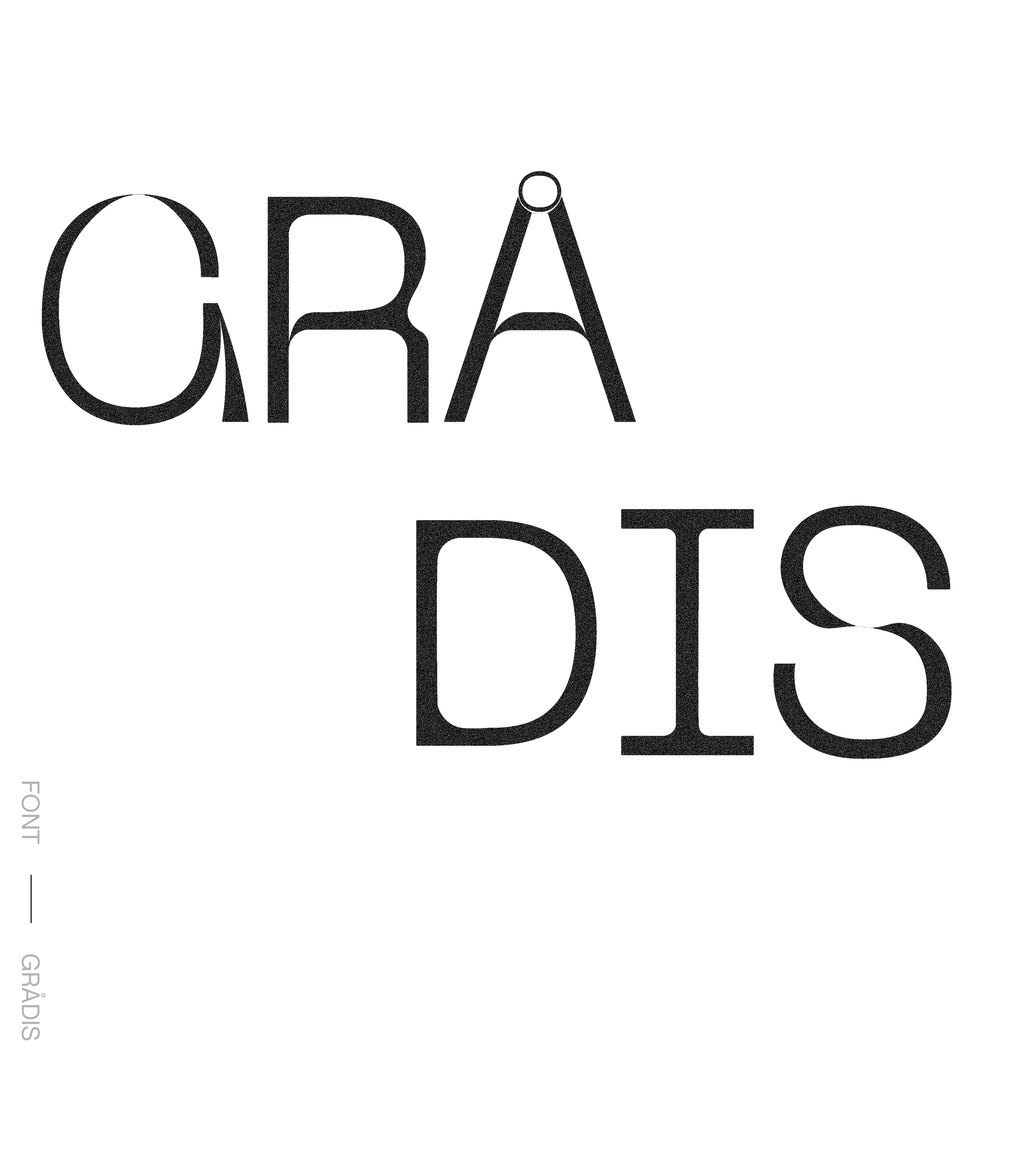
My journey into typography and font creation began during my studies at Berghs School of Communication, where I took several courses exploring the art and craft of type design. Through these studies, I developed a deep appreciation for how typography shapes visual identity, emotion, and readability.
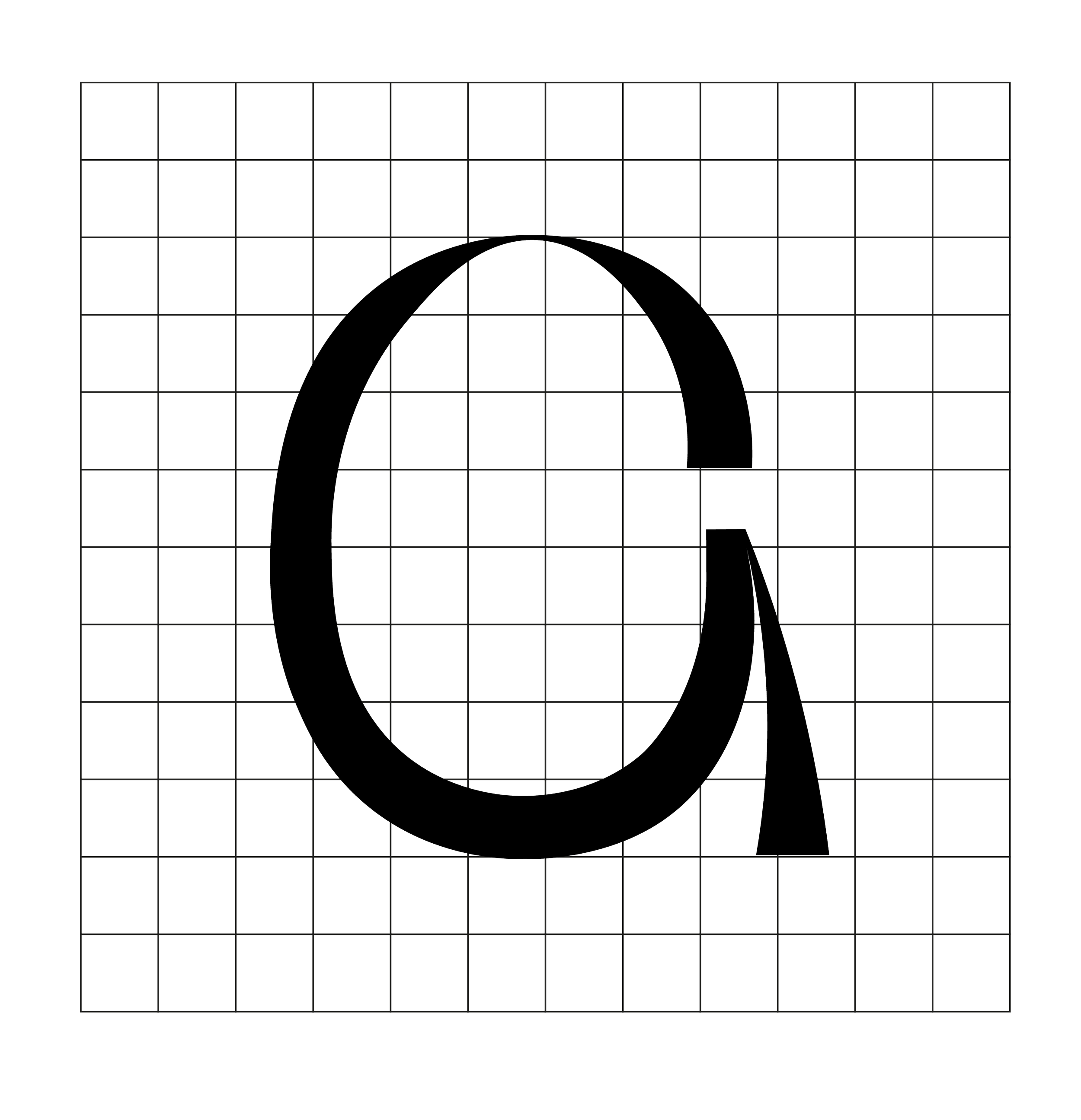
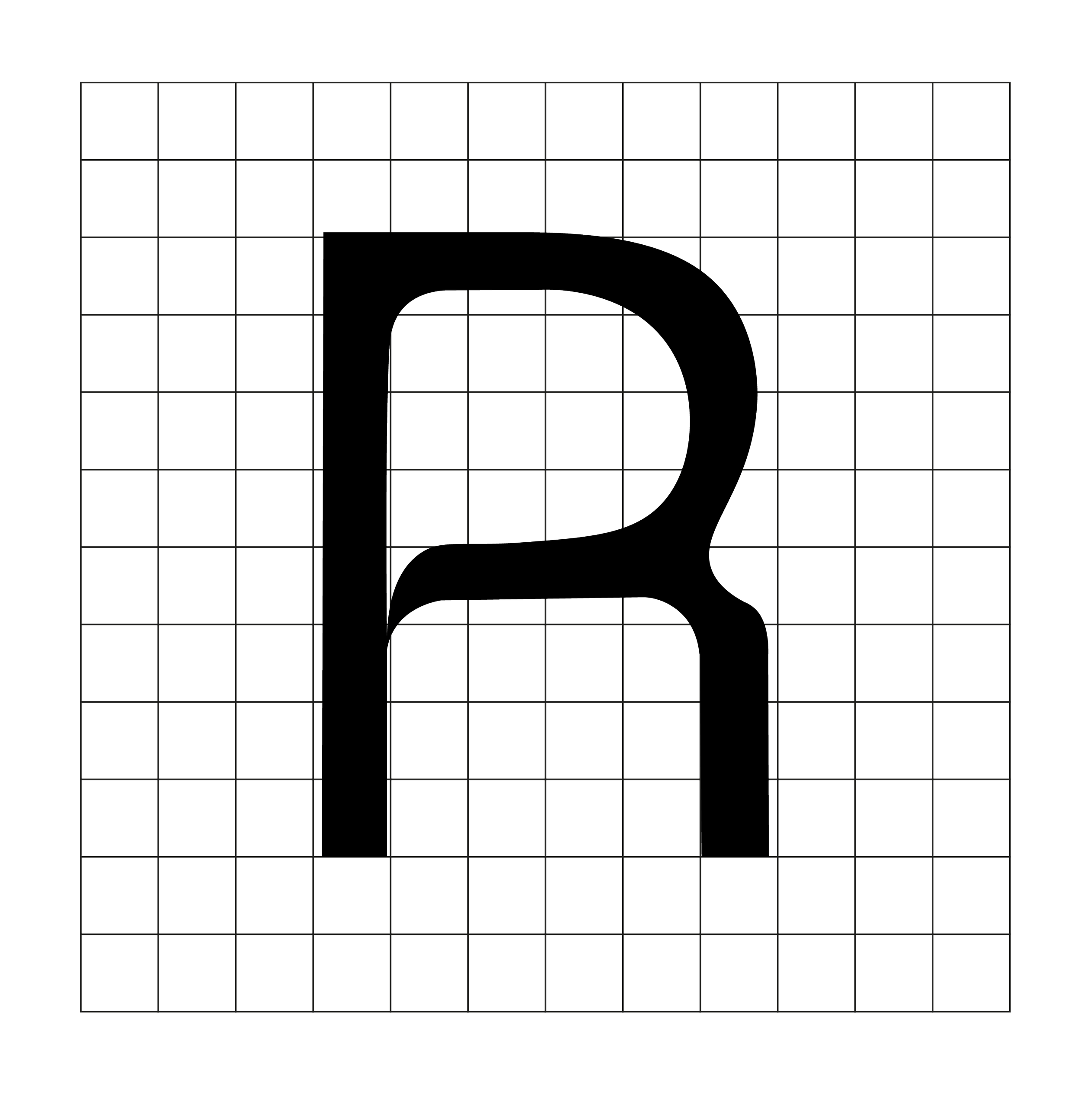
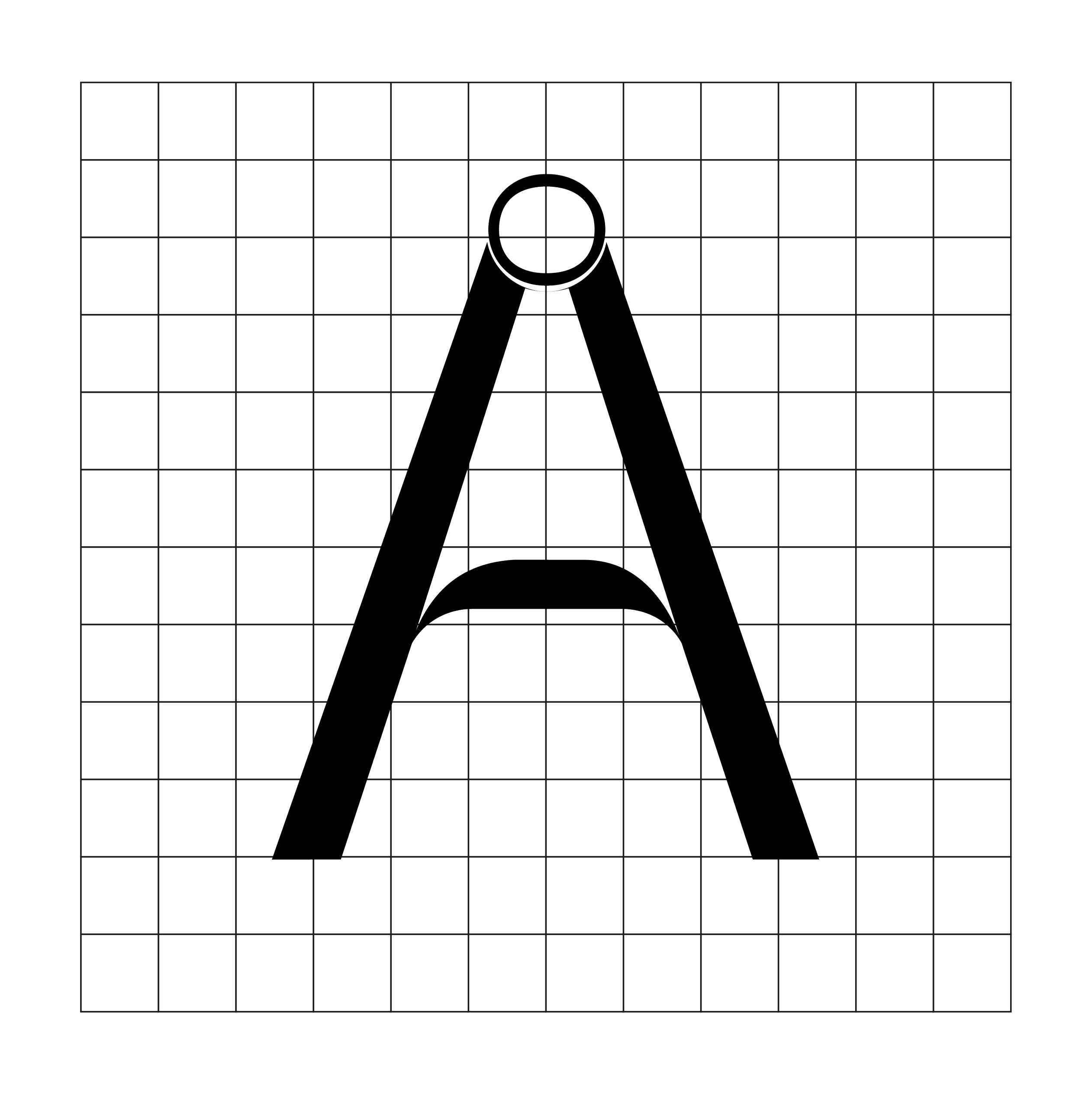
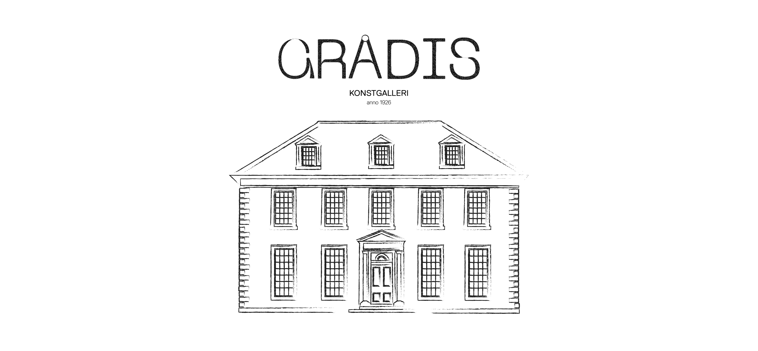
Building on that foundation, I created my own typeface, GRÅDIS — The design process became a way for me to explore the balance between structure and expression, and how subtle details in form and spacing can define a font’s personality.
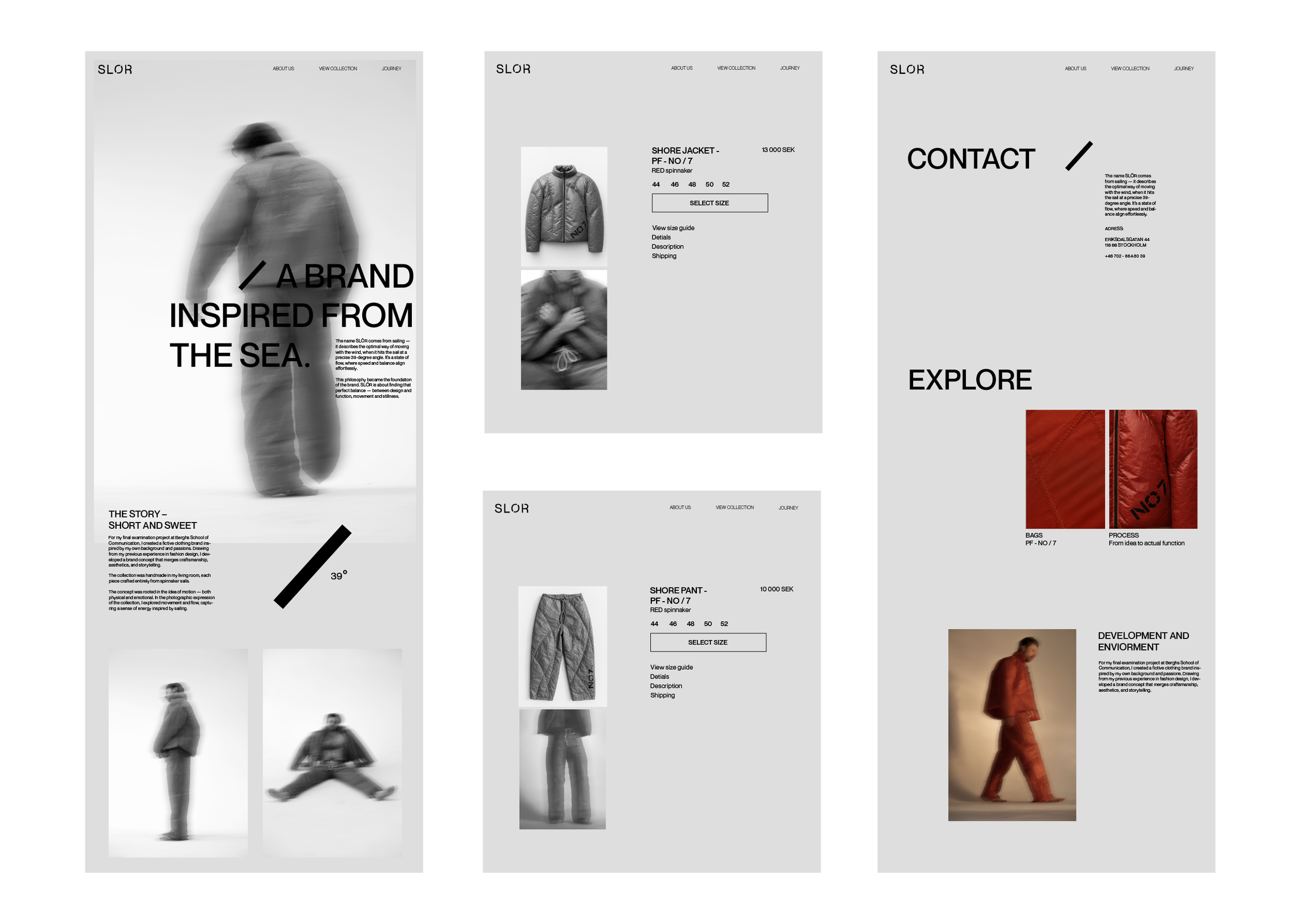
For my final examination project at Berghs School of Communication, I created a fictive clothing brand inspired by my own background and passions. Drawing from my previous experience in fashion design, I developed a brand concept that merges craftsmanship, aesthetics, and storytelling.
EXAMINATION PROJECT
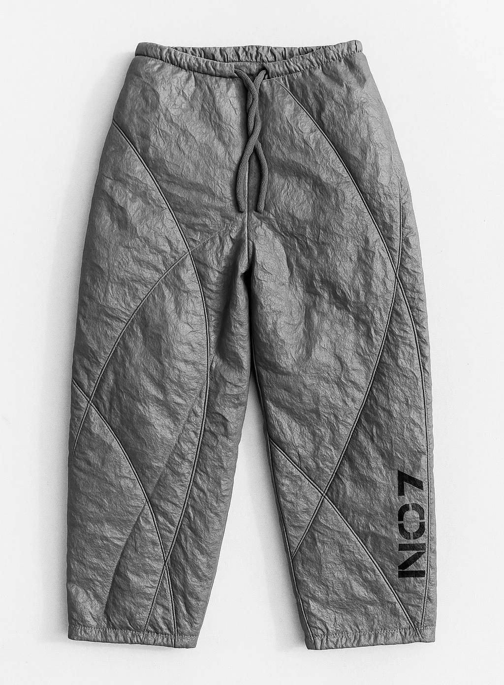
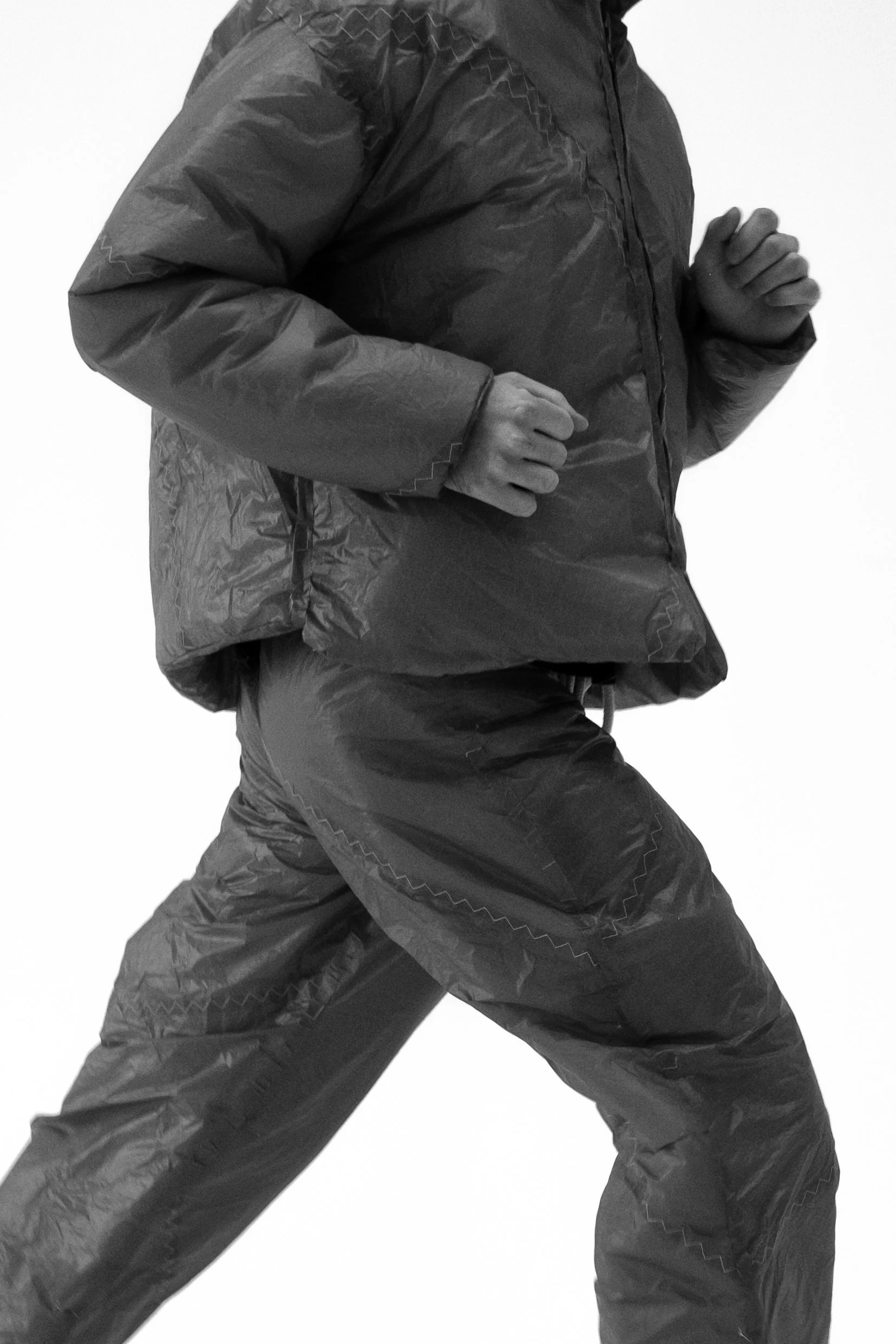
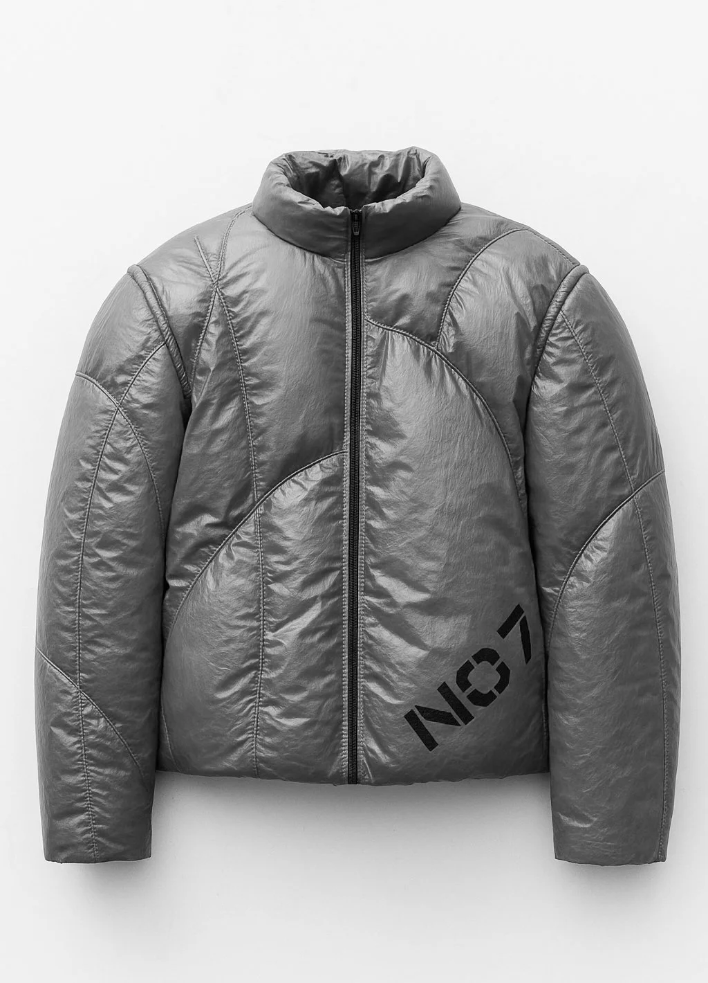
The collection was handmade in my living room, each piece crafted entirely from spinnaker sails.
The concept was rooted in the idea of motion — both physical and emotional. In the photographic expression of the collection, I explored movement and flow, capturing a sense of energy inspired by sailing.
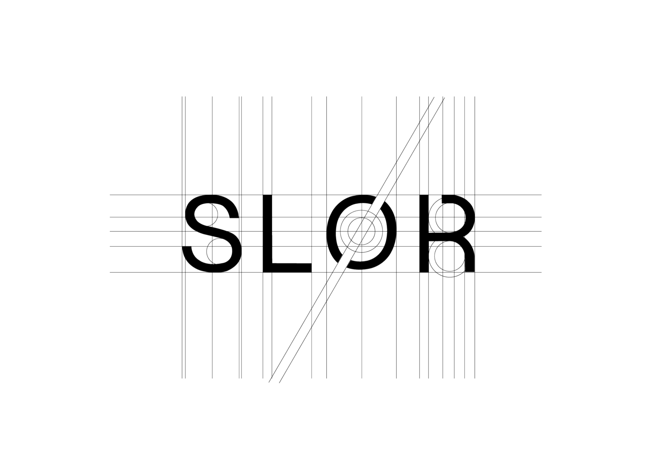
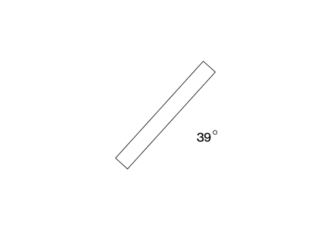
The name SLØR comes from sailing — it describes the optimal way of moving with the wind, when it hits the sail at a precise 39-degree angle. It’s a state of flow, where speed and balance align effortlessly.
This philosophy became the foundation of the brand. SLØR is about finding that perfect balance — between design and function, movement and stillness.
The logo reflects this idea through a single tilted block, angled at the same 39 degrees. At first glance, it’s minimal and almost understated. But behind the simplicity lies a story — a visual symbol of motion, direction, and intention.
